Olga’s Kitchen Website Redesign
OVERVIEW
I led the research, design, and user testing of the Olga’s website leading to 10% increase in online orders and 5% reduction in bounce rate.
FULL DETAILS
As part of a large scale rebrand, Olga’s Kitchen was refreshing its visual identity and physical stores, requiring a website to align with the new direction. Working alongside Olga’s team and a partner agency, I translated the updated brand into a user-friendly experience that prioritized accessibility and engagement.

As the designer and researcher, I conducted interviews with restaurant managers and created a customer survey to gather insights on user behavior and expectations. These findings informed the key design decisions, ensuring that the website updates directly addressed customer needs.
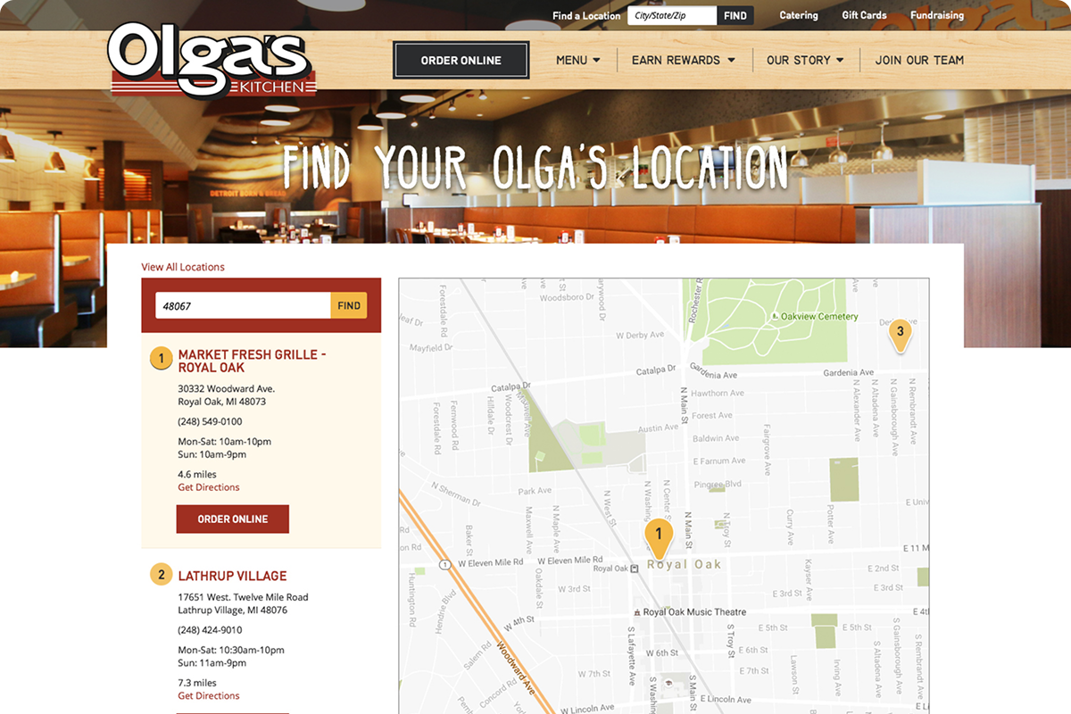
Major findings from management included a rising number of online orders as well as a focus on growing their rewards program. Customers reported that the number one thing they wanted from the website was finding a location. Understanding what’s new at the restaurant was also mentioned in 55% of the surveys.
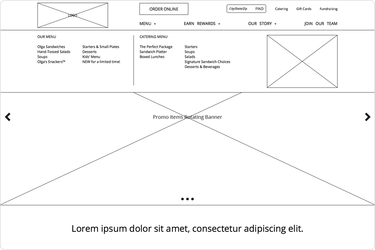
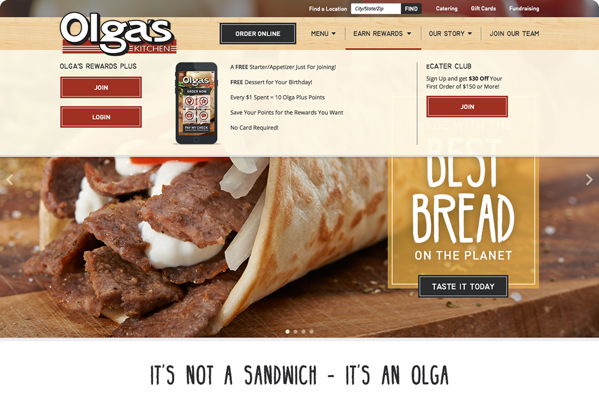
The first focus was on creating an intuitive navigation system that put the most important features front and center. Online ordering and the menu, two of the most visited pages, were given prominent placement, ensuring fast access. A simplified store locator was added to the sticky header, allowing users to find the nearest Olga’s quickly.
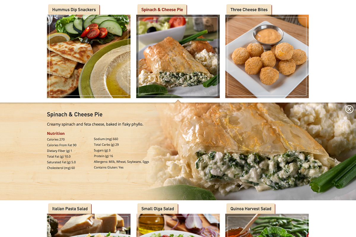
The redesign also emphasized high-quality food imagery and ensuring compliance with new government requirements, with each menu item receiving its own callout to show off visual appeal and provide the required nutritional info. Additional key callouts were designed to highlight rewards and seasonal menu items.


